Alchemic
From complex AI insights to clearer, shippable product experiences.
- Project Type
- Internship
- Duration
- May – July 2026
- Role
- Product Design Intern
- Focus
- Product Design · UX · Design Systems · AI Prototyping · Vibe Coding
At a glance
During my Product Design Internship at Alchemic, I worked across live web experiences and internal products, taking on responsibilities that went beyond conventional design deliverables.
NDA Note: Internal product and client work are confidential, so their screens are not shown in this case study.
01Approach
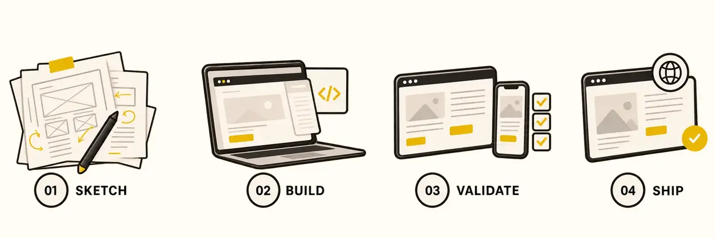
From early sketches to working experiences.
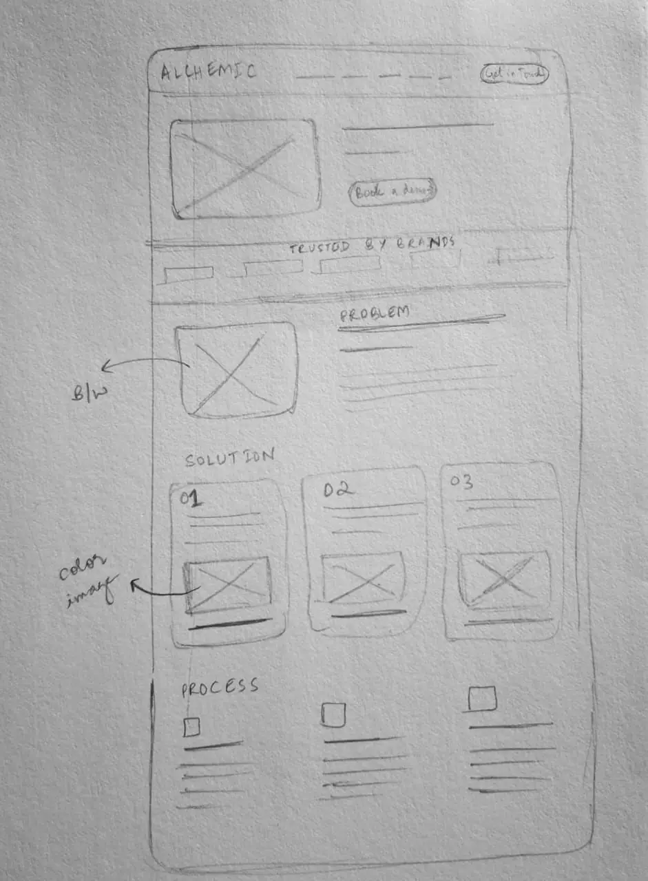
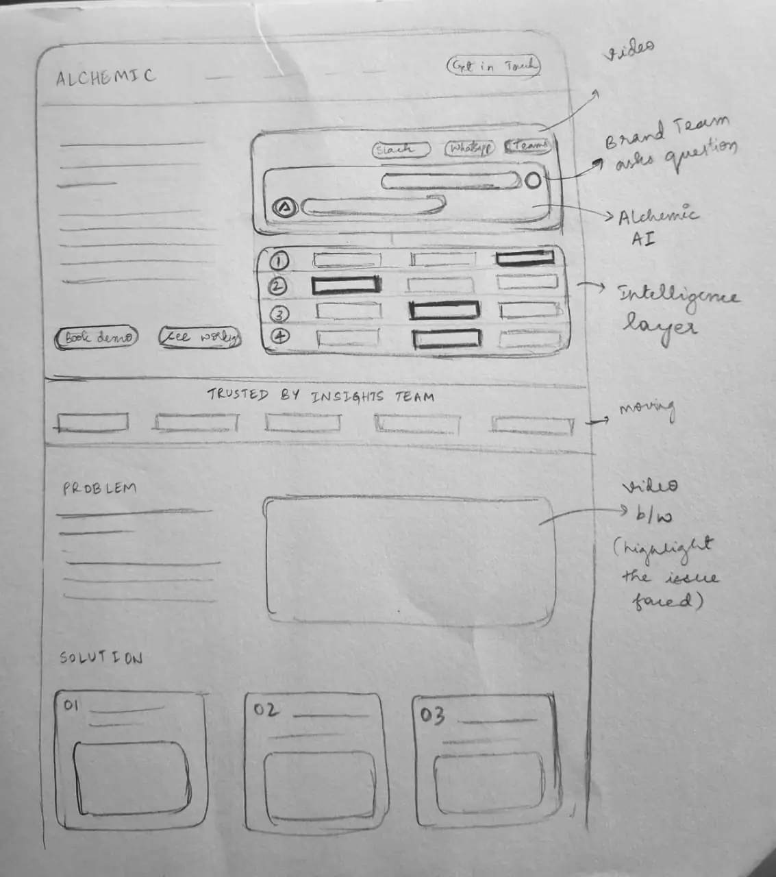
Instead of stopping at static designs, I explored ideas on paper and brought them to life through AI-assisted coding—refining interactions, testing functionality and shipping real experiences.
02Website
Designing for Understanding
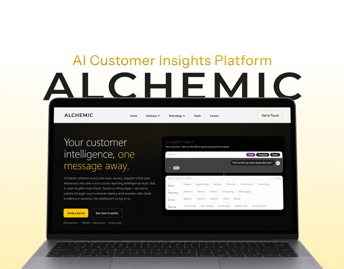
The website had the information. But was it communicating?
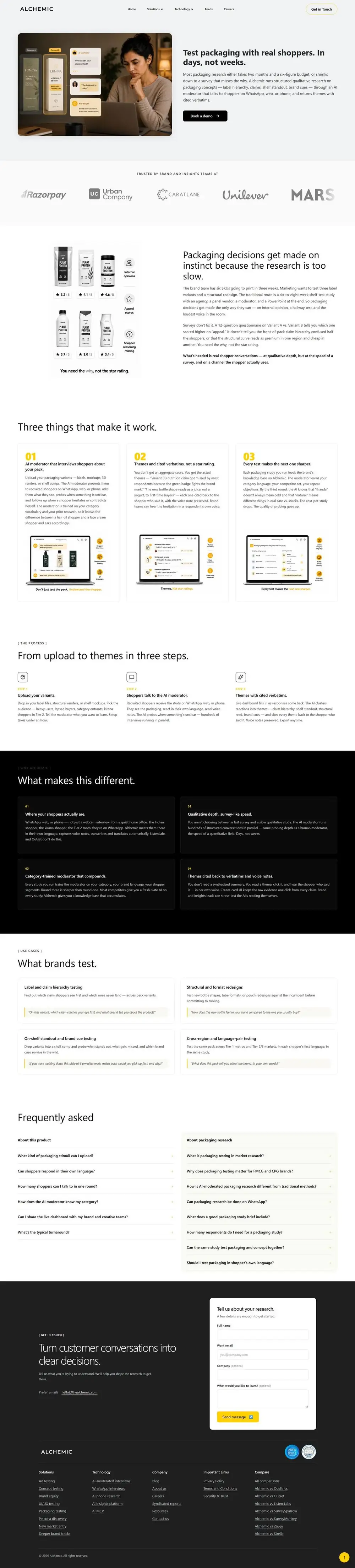
The initial AI-generated pages relied heavily on text, inconsistent visual patterns and repetitive layouts. The challenge was to help businesses understand Alchemic's offerings without making every page look identical.
The decisions behind the experience
- 01
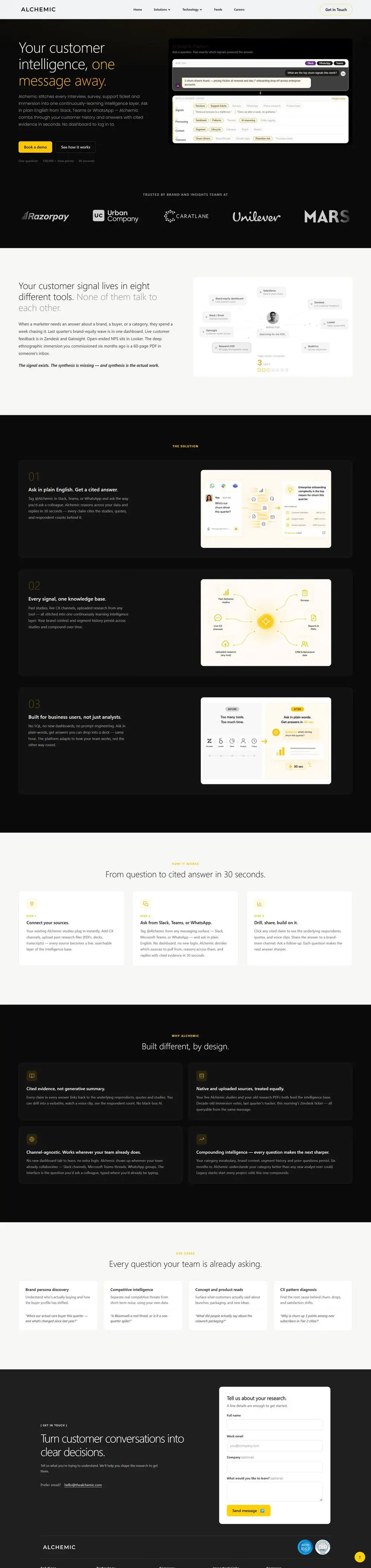
Show what the product does, not just describe it.
Purposeful visuals helped businesses understand Alchemic's offerings, processes and comparisons without relying entirely on text.
- 02
Consistent patterns. Different emphasis.
Shared typography, card treatments and FAQ patterns brought the pages together, while varied compositions helped important information stand out.
- 03
Use motion to make technology easier to understand.
A coded motion treatment communicated the Technology page's message without depending on a heavy pre-rendered video.
Responsive experience
Same message. A different layout.
The desktop compositions needed to work on smaller screens without losing their hierarchy, readability or key interactions.
Desktop View
Mobile View

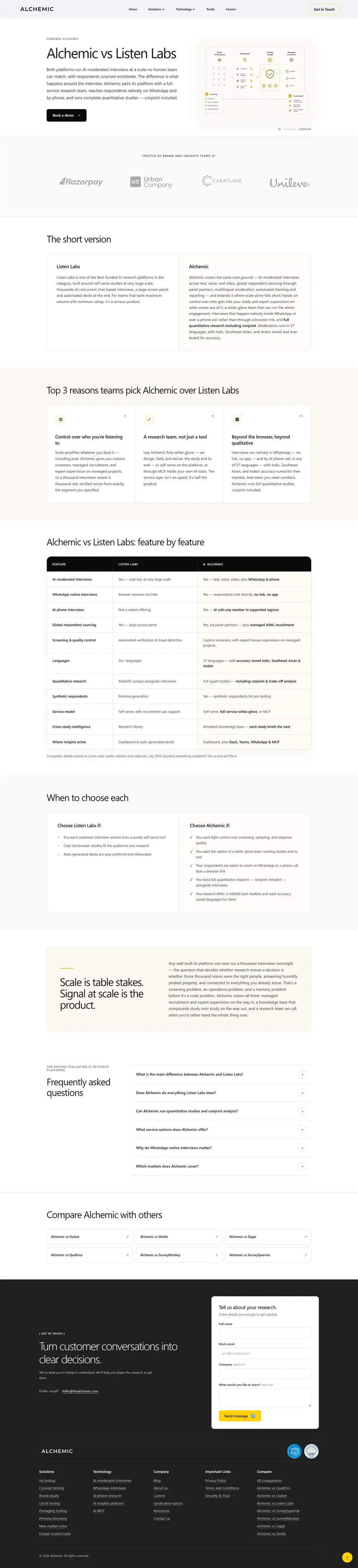
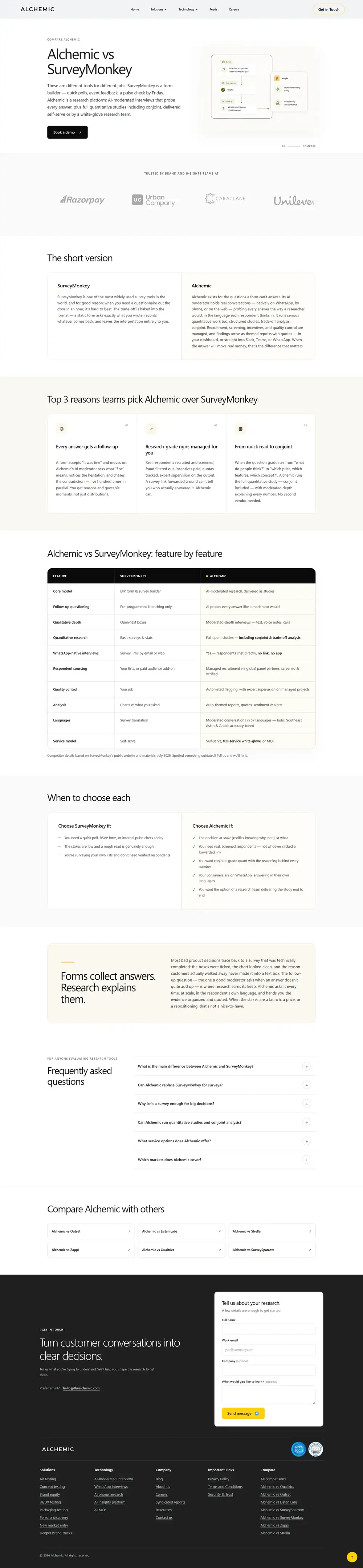
Also Shipped
Comparison pages designed, built and deployed from supplied business content.
After launch
More businesses started reaching out.
Following the website updates, my manager reported an increase in inbound business enquiries.
03Product UX
Making Research Insights Easier to Explore
What should clients see first?
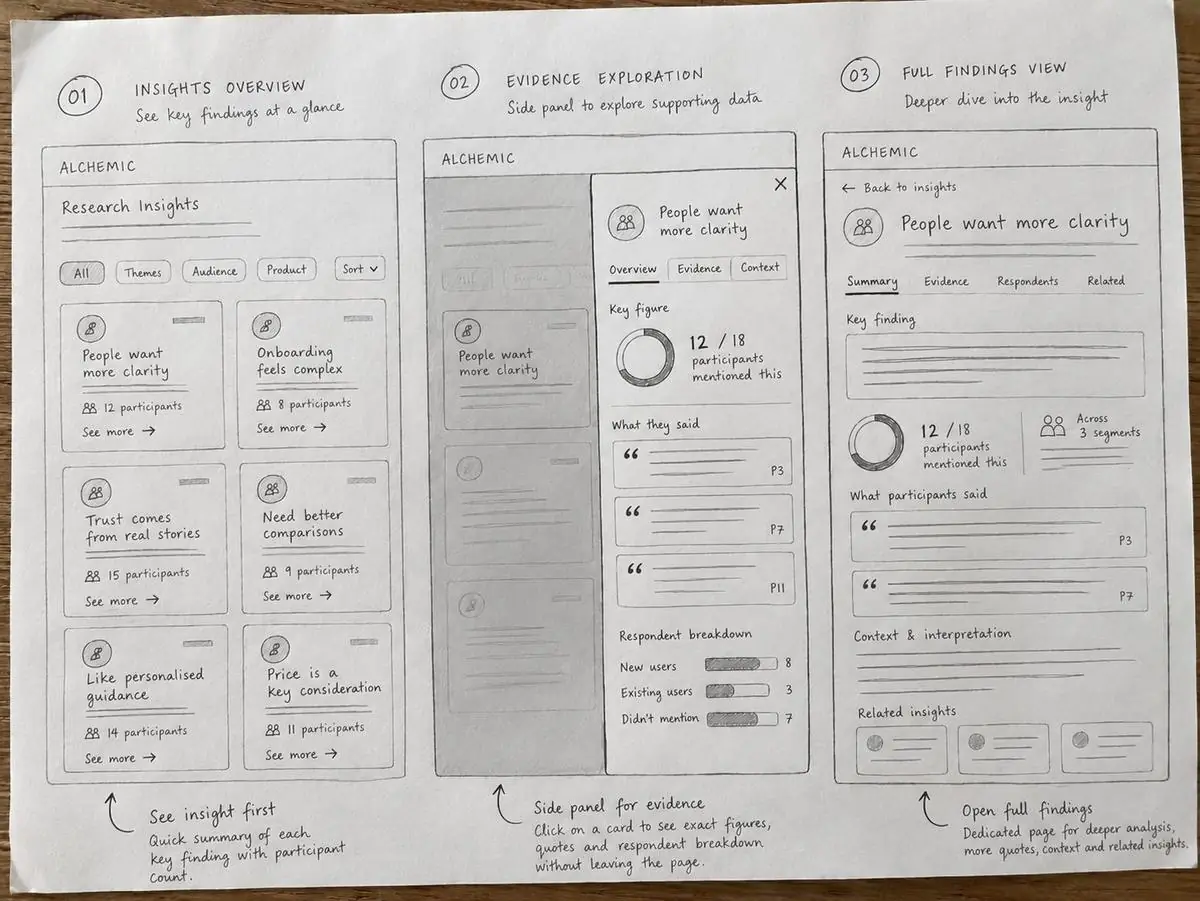
Detailed research findings were competing for attention. The challenge was to make key insights easier to understand without taking away the supporting evidence.
The design decision
The insight first. The evidence when needed.
I organised research findings into insight cards, with the key takeaway, a short observation and participant count visible upfront. A side panel made the detailed evidence accessible without taking clients away from their overview.


After launch
It was easier for clients
to skim through the insights.
Too much information that was generated was clearly organised.
Also within the product
Fewer steps. Easier access.
For internal teams, I worked on reducing unnecessary steps in existing workflows and making frequently needed information easier to access.
04Client Builds
Client Builds
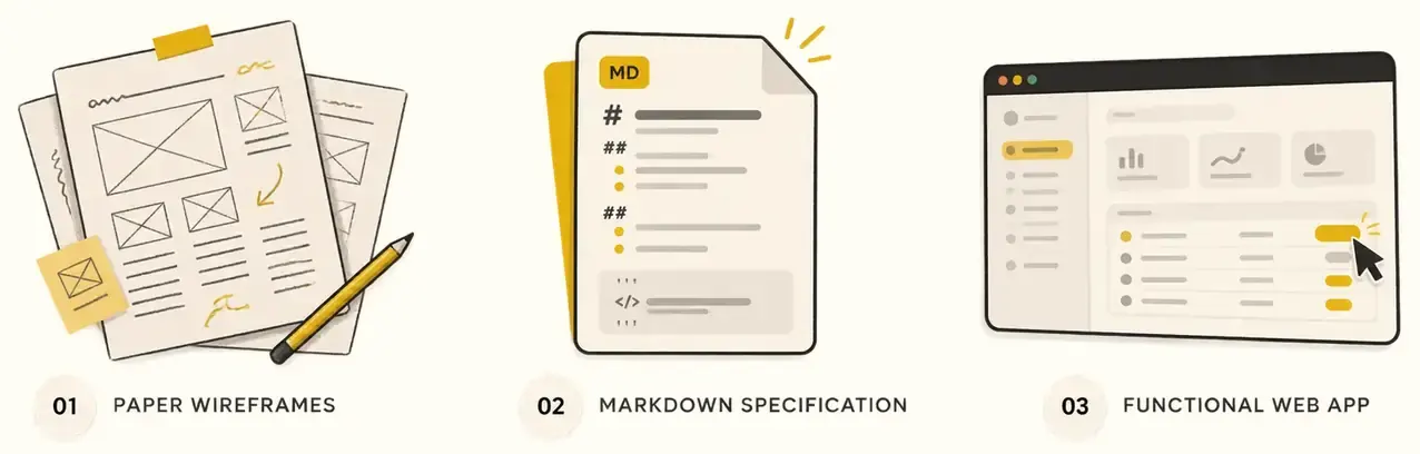
From an idea on paper to a working web app.
For client projects, I translated early wireframes into detailed Markdown specifications and used AI-assisted coding to build and refine functional web applications.
Built through AI-assisted coding
Not just clickable prototypes.
Working applications developed from early sketches and detailed build specifications.



The specification helped turn design decisions intointo instructions I could build and refine.
05Reflection
Building changed how I make design decisions.
What I took away
Generated doesn't mean finished.
AI could create a first version quickly, but I still had to question what it communicated and how people would use it.
Design decisions continued in code.
Working with functional interfaces helped me recognise interaction and responsive issues that weren't obvious in sketches.
Shipping made the details matter.
I learned to think beyond how an interface looked and take responsibility for testing, refining and releasing it.
More on Display